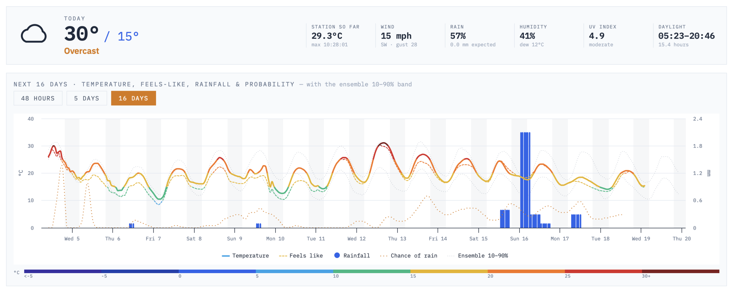

In a previous post I wrote at length in Chasing the Tween: My 25-Year Obsession with Weather Data. The chase, for a real-time dashboard with a physics-based tween, climate context and a proper view of forecast uncertainty, has carried on since, alongside experiments in vibe coding and using models for data visualisation.
The use of AI in development remains controversial. But the last six months have moved quickly, and Claude Opus 5 in particular has made it possible to build something I would not have attempted alone and perhaps moves use closer to the ultimate weather data dashboard (?). It made sense to build on one of the best weather skins out there, Belchertown, which is mature, stable, and already does the hard part well. Over a period of a few days, it developed into a now releasable GitHub repository – named Fenland.
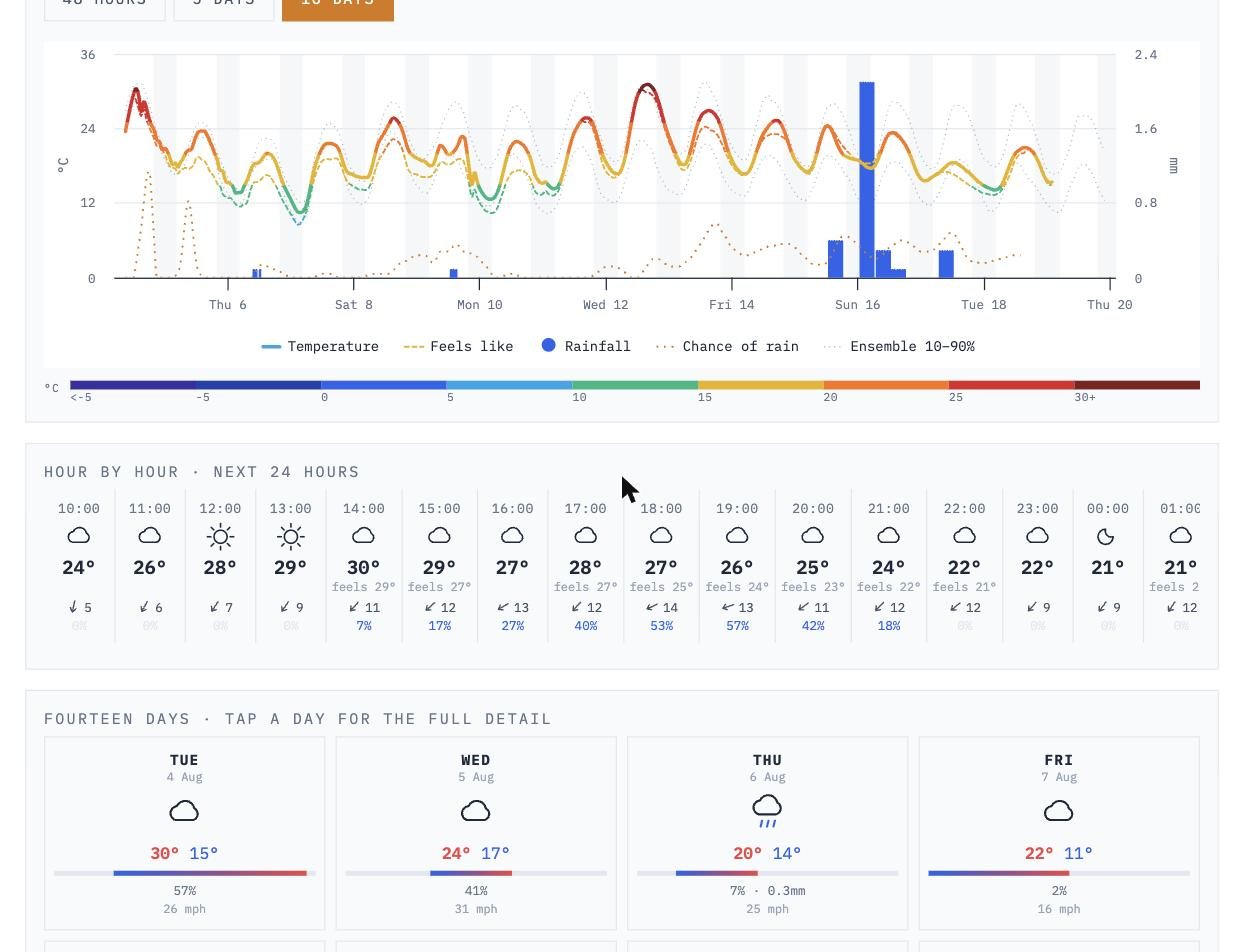
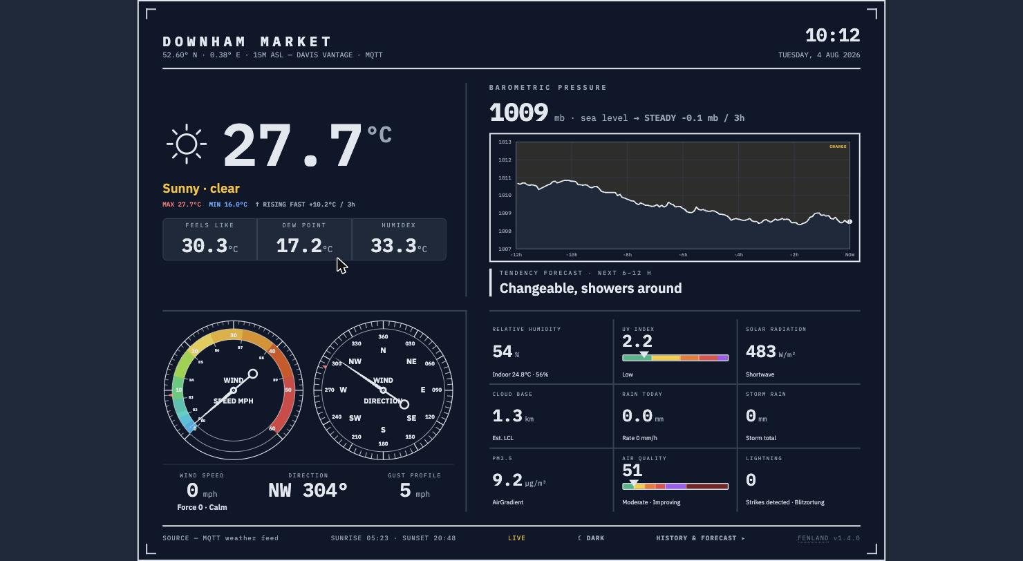
Fenland is a free, open-source weather dashboard for weeWX. It shows your station live, and adds the side that weather skins almost always leave out: how much the forecast models disagree with each other, how unusual today is against eighty-odd years of record, and how your own station’s forecasts actually score over time.
- Live demo: digitalurban.github.io/fenland
- Source and install: github.com/digitalurban/fenland
- Licence: MIT. No API keys, no accounts, no build step.
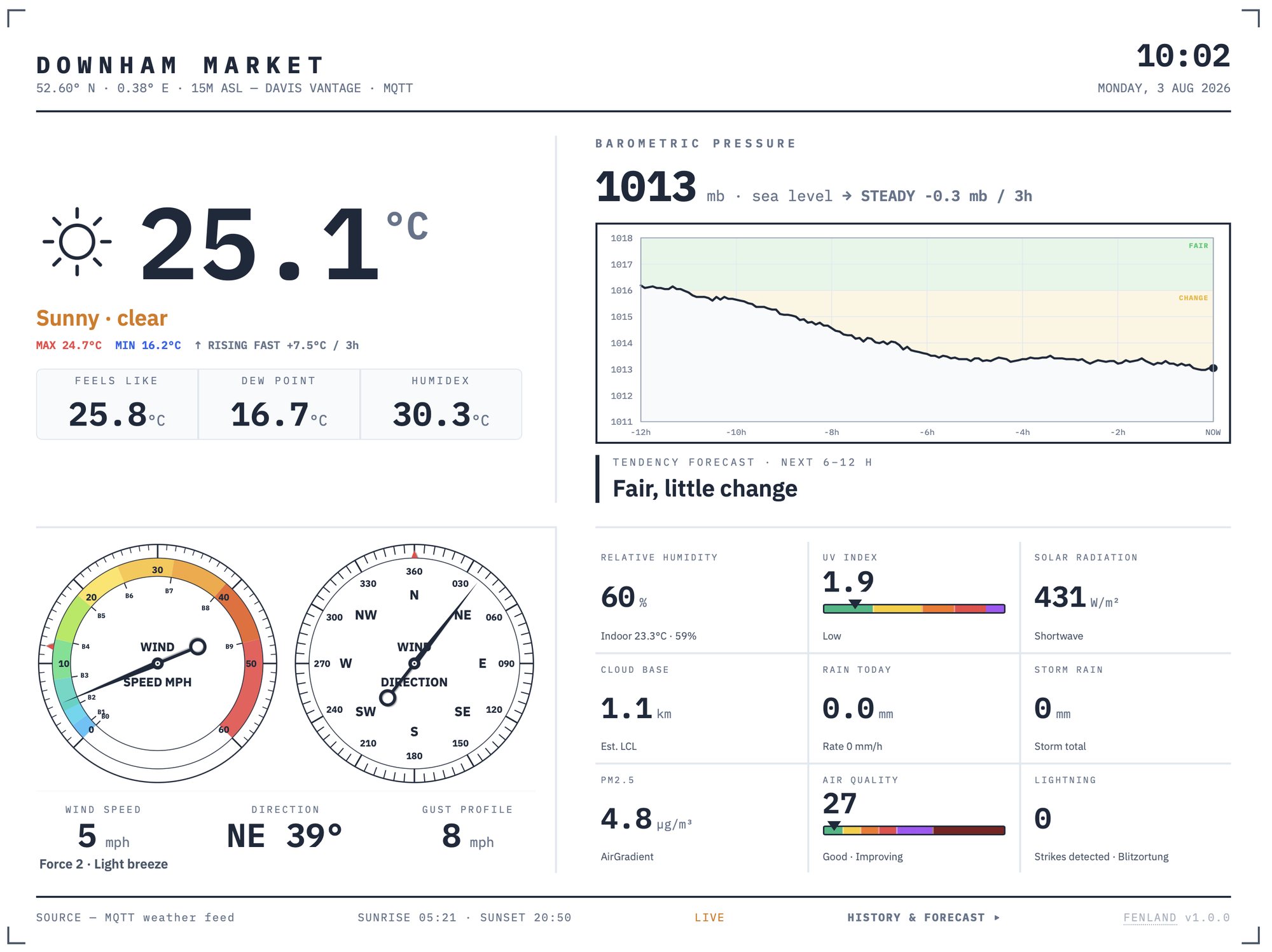
Built alongside Belchertown
Belchertown, created by Pat O’Brien, is the de facto face of weeWX for good reason. It drives the reporting engine and publishes the history and the statistics, and there is no sense at all in rebuilding that. Fenland reads its output for the History and Stats tabs and spends its effort elsewhere.
One practical note if you are installing Belchertown now: the original repository has had no commits since August 2024, and several actively maintained forks exist, of which uajqq/weewx-belchertown-new is the most current. Fenland works with either, it reads the JSON, and the format is unchanged.
Three things it does that other skins don’t
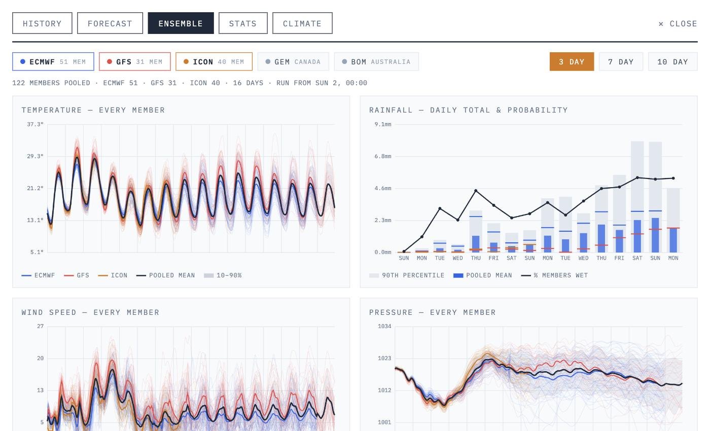
1. It shows you the disagreement
Rather than a single forecast line, Fenland pools around 120 ensemble members from ECMWF, NOAA GEFS and DWD ICON into one view, coloured by forecast centre. When the members sit tightly together, the forecast is worth something. When they fan out on day six, it isn’t, and you can see that at a glance, instead of being told “14°C on Tuesday” with false confidence.
Underneath is a day-by-day table with the pooled mean, the 10–90% range and the full member envelope, and separate confidence ratings for temperature and rainfall, because those two fail independently. You can know tomorrow’s temperature to within a degree and have no idea whether it will rain.
2. It knows what normal looks like
The climate tab pulls eighty-odd years of ERA5 reanalysis for your exact coordinates, so the page can say not just what today is but how unusual it is. “The driest July in the 87 years since 1940” is a considerably more interesting sentence than “0.0 mm”. Cumulative rainfall runs against the 1991–2020 normal, with the driest and wettest years on record for context.
3. It marks the forecast’s homework
This is perhaps the one I had wanted for twenty-five years. A script runs nightly, records what five different models forecast and what our Davis Vantage Pro actually measured, and scores one against the other by lead time.
Give it a few weeks of data and it will tell you which model is genuinely best for your site — not in general, but for your field, your valley, your patch of coast. It scores Open-Meteo’s blend, the UK Met Office, ECMWF, DWD ICON and NOAA GFS side by side. That is a question only your own data can answer, which is rather the point of having a station at all.
The tween, finally
As I set out in Chasing the Tween: My 25-Year Obsession with Weather Data, in the Flash era, Weather Display Live’s needles moved with a smooth, weighted ease that nothing since has quite matched. Argubaly, I have been chasing that “tween” ever since.
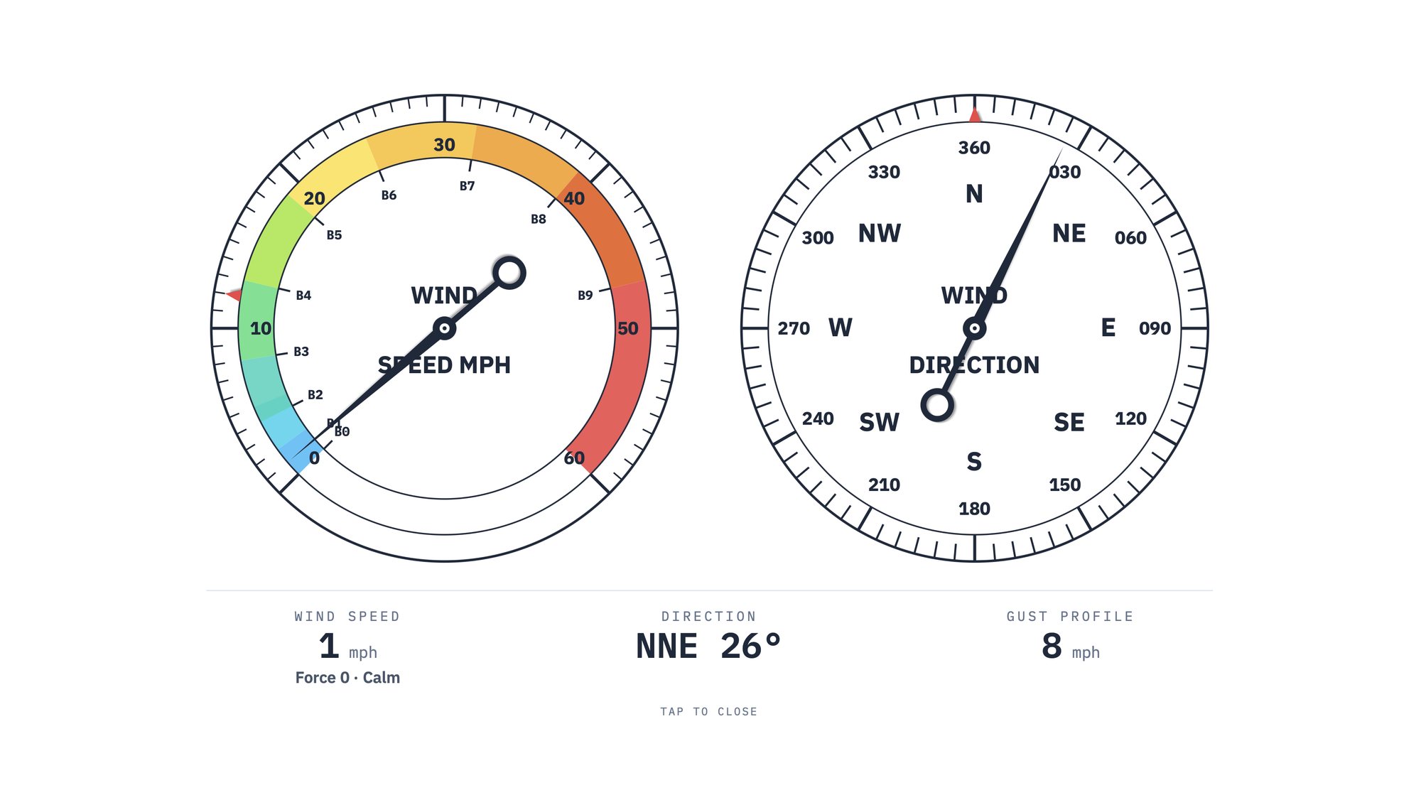
Fenland’s wind needles are not animated with a CSS transition. They are driven by a damped spring: acceleration proportional to how far the needle is from where it should be, minus a damping term proportional to how fast it is already moving – coded by Opus 5. The two constants work out to a damping ratio of about 0.8, which means the needle is deliberately underdamped, it swings slightly past the target and settles back, exactly as a physical moving-coil instrument does. A step from calm to gale overshoots by around 1.3% before coming to rest.
The compass takes the short way round, too. Wind backing from 350° to 10° moves the needle twenty degrees clockwise, not 340 the other way.
None of which is necessary but its somehow the reason I started chasing this in the first place – watching the needles move is oddly satisfying, but maybe thats just me.
What the AI was actually good at
In the earlier post I wrote that vibe coding is good, but not that good. Having now taken something from prompt to a versioned, documented, installable release, I would sharpen that.
Opus 5 has been notable in the development path, adding the climate records, the 16-day ensembles, and the comparison against actual measured data in a way earlier models would have made a mess of. It has been akin to sitting next to a computer scientist who also knows climate data, building the dashboard I actually want. Others will disagree with, dislike, or push back against the use of AI here. But alongside a day job as Professor of Digital Urban Systems at UCL, it is the difference between this existing and not existing.
What it was not was effortless. Getting to a working dashboard genuinely takes an hour. Getting to something a stranger can install took considerably longer, and almost none of that time went on the interesting parts. It went on the unglamorous ones: making the unit handling correct so an American station reporting in °F and inches displays properly; discovering the browser was caching the JavaScript so my own fixes were not reaching my own phone; and a race condition that rendered the history charts in the wrong colours, but only on mobile, where a slower connection lost a timing window a desktop always won.
Those are the problems that never show up in a demo, and the ones that separate a personal dashboard from a piece of software. The model was genuinely useful at all of them, but only because I could describe the symptom precisely, and because I pushed back when the first explanation was plausible rather than correct. On at least two occasions the confident diagnosis was wrong and the real cause was duller.
An unexpected use: the dashboard checks the hardware
One last thing I had not anticipated. Having all this comparison data in place turned out to be useful for checking the station.
I had suspected the anemometer bearing was on its way out, noting a few days again that the trees near our weather station were moving considerably more than 9 mph of gust would suggest. Rather than guess, we compared the station’s daily wind against the model’s across the whole of 2026 and looked for a trend. There wasn’t one. The ratio is noisy but flat, and the gust-to-mean ratio has not shifted either, which is what you would expect to change first as a rotor stiffens. So the anemometer has probably always read low, sheltering, most likely, rather than getting worse.
I’m still not quite conviced but, our data check now runs nightly alongside the forecast verification, and will say so if the relationship starts to drift. Twenty-five years in, the dashboard finally has a tween to be proud off and has started keeping an eye on the weather station itself….
Getting it
Fenland is on GitHub at github.com/digitalurban/fenland, with a live demo at digitalurban.github.io/fenland. Clone it, copy config.example.js to config.js, set your coordinates, and serve the folder — there is no build step and nothing to compile. GitHub Pages will host it for nothing.
Display units are configurable (°C or °F, mm or inches, mb or inHg, and four wind units), and your station’s own units are configured separately, so a US station can be shown in metric and vice versa. All the forecast data comes from Open-Meteo, whose free, keyless, attribution-only API is the reason a project like this can exist at all.
As mentioned at the top, if you are new here, the long version of how we got from Adobe Flash to this is in Chasing the Tween: My 25-Year Obsession with Weather Data, twenty-five years of Weather Display, Cumulus, Steel Gauges, weeWX and Belchertown, ending on a physical analogue display from a small British company that, in my view, still has not been beaten. Fenland does not quite beat it either. But it now gets closer than, arguably, anything I have built in twenty-five years of trying.