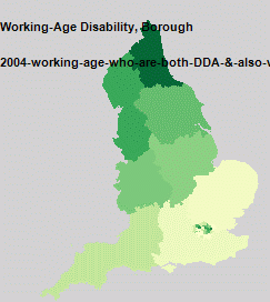
Richard Milton here in CASA is working on our new National Centre for Research Methods funded TAILISMAN project. One aspect of the project is looking into data visualisation, here we present a guest post by Richard on the automatic visualisation of data from the London Datastore... This started out as an experiment in how to handle geospatial data published in Internet data stores. The idea was to make an attempt at structuring the data to make searching, comparison and visualisation easier. The London Datastore publish a manifest file which contains links to CSV files that are in the correct format for MapTube to handle, so I wrote a process to make the maps automatically. The results are one thumbnail map for every field in the first hundred datasets on the London Datastore. I stopped the process once I got to a hundred as it was taking a long time.
The name of the dataset and name of the column being visualised are shown in the top left of the map, while the colour scale is a Jenks 5 class range between the min and max of the data. This sort of works, but raises more questions than it answers about the data. To start with, one interesting thing that jumps out of the data is that there was a step change in London population around 1939, from the “London Borough Historic Population” dataset.
The first problem with this is that there is no structure to how the thumbnail maps are placed on the image. The idea is to use a data classifier and group maps according to how similar they are, so distance would be proportional to similarity. This work is still in progress.
The next problem is with the colour scales, as it commits the cardinal sin of not showing one. The maps are supposed to be representative, so all use the green Jenks 5 classes, but it’s obvious that this has gone wrong on most of the maps. The reason for this is that the London Datastore include data in the CSV files at different geographic scales. Most of the maps show London at Borough level, but also contain data for England, Scotland and Wales which mess up the automatic colour scale. The top range ends up being the larger geographic areas which you can’t see, so the maps end up with just four classes on them. On some of the maps you can see the Government Office Regions (Midlands, Wales, South East etc), along with Borough level data for London.
A map showing data at different geographic scales. London has data at Borough level while the rest of the country is at GOR level.
The final problem, which also relates to different geographic scales, is to do with almost all the maps visualising either a count of people or events. Most maps are a population of some kind, so displaying population density rather than count would make a lot more sense.
As a proof of concept, this demonstrates that we can handle the maps automatically from an Internet data store. One thing that’s obvious from looking at the zoomable map view is that you need the ability to click on one of the thumbnails and go straight through to the full size map with all the information about what is it. There is also no search facility so you can’t find anything, but the next proof of concept is where things will start to get interesting….
We will be following progress and the forthcoming TALISMAN project blog with more results in the new year.
The Sky Scratcher is a kickstarter project which at the time of writing has 38 hours to go – in short there is still time to back it.
If we had a cat here at digitalurban it would without doubt be the Sky Scratcher – a revolutionary, architectural spin on the cat scratching post. Built from more than 125 corrugated cardboard die-cut pads, a bamboo plywood base and center pole, the goal is to use Eco-friendly materials that are both safe for your cats and aesthetically pleasing to the human eye.
Set up my Mike Estes, his love for all things creative drove him to reinvent the cat scratching post with The Sky Scratcher. Mike states that not only will your feline friends enjoy scratching to their hearts content, you will also enjoy a high quality piece of art that will add a stylish accent to any room in your home or office…
Spinger have published, in Personal and Ubiquitous Computing, a paper by Ralph Barthel, Kerstin Leder Mackley, Andrew Hudson-Smith, Angelina Karpovich, Martin de Jode and Chris Speed based around our TOTeM/Internet of Things work. Entitled, An Internet of Old Things as an Augmented Memory System, the full abstract and download link are below:
Abstract
The interdisciplinary Tales of Things and electronic Memory (TOTeM) project investigates new contexts for augmenting things with stories in the emerging culture of the Internet of Things (IoT). Tales of Things is a tagging system which, based on two-dimensional barcodes (also called Quick Response or QR codes) and Radio Frequency Identification (RFID) technology, enables the capturing and sharing of object stories and the physical linking to objects via read and writable tags.
Within the context of our study, it has functioned as a technology probe which we employed with the aim to stimulate discussion and identify desire lines that point to novel design opportunities for the engagement with personal and social memories linked to everyday objects. In this paper, we discuss results from fieldwork with different community groups in the course of which seemingly any object could form the basis of a meaningful story and act as entry point into rich inherent ‘networks of meaning’. Such networks of meaning are often solely accessible for the owner of an object and are at risk of getting lost as time goes by.
We discuss the different discourses that are inherent in these object stories and provide avenues for making these memories and meaning networks accessible and shareable. This paper critically reflects on Tales of Things as an example of an augmented memory system and discusses possible wider implications for the design of related systems.
Crowd, transport and urban simulations are at their roots down to ‘Agents’ or ‘Objects’ that are assigned a set of rules as to how to moves in relation to both the environment and other agents around them. 3D Studio Max has a built in ‘Crowd and Delegate’ system which can be used to assign behaviour and therefore create realistic traffic of pedestrian systems in 3D space.
The movie below displays our first tentative steps to explore emergent behaviour via the introduction of simple rules. The movie starts out with a basic ‘wander’ behaviour where the agents only knowledge is the shape of the surface. Moving on we assign each of our ‘cubes’ (of which we have become quite fond of…) a level of vision so they can see ahead and therefore avoid each other and objects in their environment.
Thirdly, the agents seek a ‘sphere’ which could be viewed as a source of food. While being aware of each other and tweaking the way the cubes move a swarm behaviour emerges. Finally, we introduce competing groups with two priorities, firstly to eat and secondly to stay as a group. The majority choose the group over the food but a couple stray off in search of sustenance and lose the other members. Previous steps in our visualisation of agent based models are based around a simple flocking examples. This model is an attempt to mimic the flocking of birds, while the resulting motion also resembles schools of fish. The flocks that appear in this model are not created or led in any way by special leader rather, each bird is following exactly the same set of rules, from which flocks emerge.
We have exported the model into 3D Max providing the visualisation below, as ever these are early days but the results seem to run well with 300 ‘birds’ over 1000 frames. The birds are rendered as cubes at the moment for proof of concept:
Music “Funkmelon Blooz” (Electronica)
The birds follow three rules: “alignment”, “separation”, and “cohesion”. “Alignment” means that a bird tends to turn so that it is moving in the same direction that nearby birds are moving. “Separation” means that a bird will turn to avoid another bird which gets too close. “Cohesion” means that a bird will move towards other nearby birds (unless another bird is too close). When two birds are too close, the “separation” rule overrides the other two, which are deactivated until the minimum separation is achieved.
The three rules affect only the bird’s heading. Each bird always moves forward at the same constant speed.
If we were using the built in Crowd and Delegate system a true 3D flocking system would be possible, but it would be pure visualisation, by importing via NetLogo you gain access to the raw data and thus spatial analysis is possible. It is also quick to model and provides the best of both worlds – 3d visualisation and complex modelling.
While 3D Max is of use for crowd and particle simulation when it comes to modelling complex systems an external package is required, such as NetLogo. The movie below details our first steps at CASA (home of digital urban) to export a basic traffic model from NetLogo into 3D Studio Max. The import script was written by our new PhD student, Ateen Patel and opens up a vast array of opportunities to both visualise and model the city.
Music by The Tedd-Z Cookbook, Aerodrome (Funky Shuffle Remix) NetLogo is a cross-platform multi-agent programmable modeling environment that is widely. It is particularly well suited for modeling complex systems developing over time. Modelers can give instructions to hundreds or thousands of independent “agents” all operating concurrently. This makes it possible to explore the connection between the micro-level behavior of individuals and the macro-level patterns that emerge from the interaction of many individuals.(Nation Master Encyclopedia).
How does this relate to the city? The next part is to put in real geographical data and to get the agents movies and reacting to each other on a spatial network, more on that to come. Perhaps using a particle system as per the movie below:
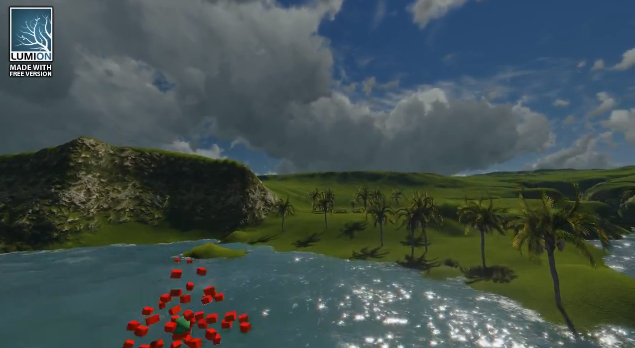
All of these models are going into our exhibition space to allow a step by step guide to the principles of agent based modelling. At the moment we are weighing up two options – Unity and Lumion. Our previous trials in Unity are below:
Unity is great, it is a fully featured game engine, however we are also looking at Lumion. Lumion, aimed more at direct visualization, is remarkably easy to learn, the movie below is the result of our first 20 minutes working with Lumion from first load to final output. It is merely proof of concept, but taking the output from Max and dragging into Lumion is refreshingly simply:
