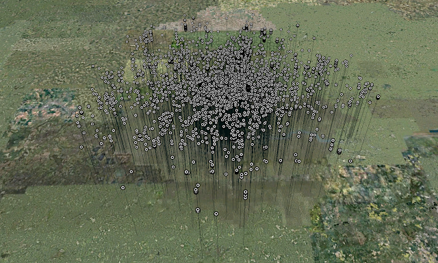
Regular readers will know we have been logging data in 12 cities via our Tweet-o-Meter, its still early days but the results for a weekend in London are intriguing.
The data covers a weekend period from Friday evening to Monday morning containing 380,000 individual tweets. Within these 60,000 were geo-referenced, tweeted by 5,500 individual users.
In terms of density the focus is on central London with local hotspots as the weekend progresses, around Kings Cross and Old Street. There is also a noticable trace along the main transport routes into and out of town, noting that we seem to be tweeting while on the move. The clip below details the visualisation in Google Earth:
Music – ‘Social Awkwardness‘ by Xanthe over on unsigned bands.
The clip reveals a message cloud rising and hovering above London as a time-space aquarium where the time is plotted as the height information. Interestingly Google Earth is becoming the visualiser of choice for such data sets, the combination of location, imagery with the ability to view by time makes it a formidable engine for data visualisation.
Thanks go to urbantick who converted the data via a custom VB script.

Looks nice, but difficult to really see where the Tweets are coming from. Would be better I think if they weren’t on their huge stalks and were at ground level.
Hmm, nice idea but rather confusing!
What an intriguing site! Will feature in my Data Visualisation References resource list, aspiring to be the most comprehensive on the net. (Will be updated a little later today, please be patient.) If you miss anything that I might be able to find for you or if you yourself want to share a resource, please leave a comment.